Brown Bear Spruce Tip IPA
Designed for: Kenai River Brewery Co.
I created this design for their annual label competition - this particular year it was for their unique Spruce Tip IPA. I drew inspiration from bears finding themselves in strange locations - like the tippy-tops of trees. Tart, slightly sweet, and packed with Vitamin C, spruce tips are enjoyed raw or used in a number of dishes. Many animals (including bears) will eat them, as they are a nutritious food source in early spring, when food is limited. I wanted to highlight the importance of spruce tips for Alaskan wildlife and way of life...

Unagi
Designed for: American Unagi
American Unagi needed a design for a new product line. American eel is a staple in many cultures, however some individuals are turned off by their snake-like appearance. To avoid this, I decided to design an eel in the shape of a hook. I also pulled the bright red and green colors from the Unagi Kabayaki packaging traditionally found in Japan. Since this product was primarily geared towards Japanese markets, I added Unagi (Japanese for freshwater eel) in Kanji, furthering the Asian influence while also providing a bilingual option for both the product and company name.

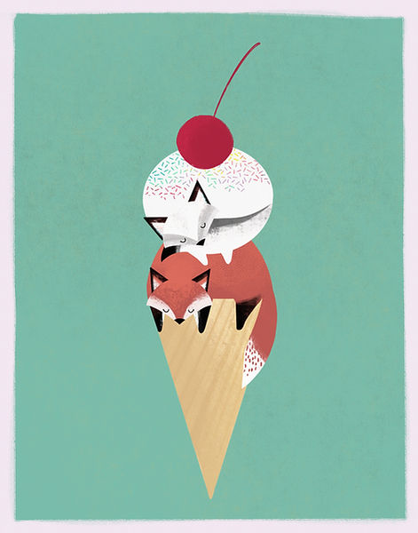
Two Scoops of Fox
Designed for: Stonefox Farm Creamery
I designed this piece for Stonefox Farm Creamery so that they could use it in their promotional materials and for stickers. Two scoops, two types of foxes, absolutely adorable. I've been told that it's their most popular sticker and a favorite for kids, which happens to be their biggest client base!